
A developer faces hurdles while learning a new platform. Firebolt SDK is no exception to that rule. If anything, it meets more of a challenge because of its recent release.
I led a team's effort to discover how developers learned, applied that research to build a developer portal, developer testing app, and kicked off a new platform over a year and a half. We launched four products in six-week dev sprints.
A few years ago, Comcast and other large cable companies formed RDK, an open-source platform to run their set-top devices.
After version one, a problem arose when demand for third-party device demand fell short and provided little incentive for popular applications to join the platform. Even worse, competitors like Google saw an opportunity to enter the market with a version of Andriod for TVs and set-top boxes.

The initial discovery focused on how developers learned and what methods were the most effective. The team and I needed a holistic overview of what was required and how to get there. We sat down with stakeholders, developers, and the product team to define goals.
We first tackled the marketing website; next, we learned and built a lesson-based system to onboard new developers.
The success of our first two products was paying off unexpectedly. Instead of the influx of independent developers we initially sought out, we were getting more corporate publishers. That led to more strain for our QA and Dev support teams. The developer testing application became our next priority.
User Insights
We didn't have to start entirely from scratch; There was a version of the application available and lacked most of what we were trying to achieve.
The team objectives were to rapid prototype, iterate, and repeat until we achieved:
Goals
Phase 1
Goals
Phase 1

Our hypothesis was developers who would use the app for the first time would want to see their app first. We imagined a scenario where developers could have several builds of their app and want a way to organize them.
Conclusion
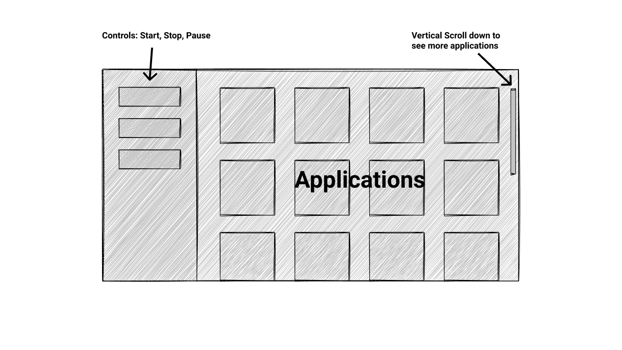
Wireframe 1
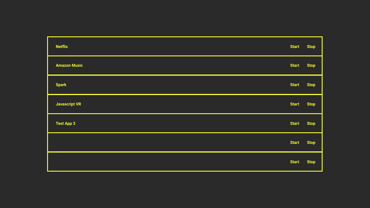
I asked our QA team for help; I wanted to know if our assumption about the groups is warranted. Most teams work on a max of three builds, which is far under our hypothesis. Dropping that opened up the possibility to focus on functions: Start and Stop.

Conclusion
Wireframe 3
Paper Prototyping was the most agile and reliable way to test a set-top box application. Our testers were split between high and low domain knowledge. Early tests revealed:
Test Results
Test Results
Note: Two of the participants noted that the low-quality keyboard impacted their experience.

In the first round, our testers were asked to open an application then stop it.

To prove that we had solved the navigational problems, we asked the next round of testers to perform the first test. To advance the experience, we asked them to perform a secondary task: Open an application, then suspend it.
Test Results
Test Results
Our iteration included changing from Options to Controls to help clarify the shortcut commands drawer. We also added toasts, which showed the command they used after using it, and removed the second drawer option.
Test Results
Test Results

Testing version three came later during our run-up to deployment for version six. We added more screens and toasts to the test to show participants feedback per their actions. In addition to that, we added an Xfinity remote. The task was to use the keyboard or remote to open, suspend, then return home.

Conceptualizing the initial design, I kept a couple of thoughts in mind. Refer to what we learned from testing and work within these constraints:

Design System
Design System
Brandmark progression


Design System
Colors
RGB(41, 41, 41) RGB (118, 118, 118)
RGB(0, 0, 0, 90)
RGB(0, 169, 157)
RGB(255, 127, 80))
Design System
Typography
Version 2 Changes


One unforeseen problem was with SVG's. Scaling became a problem from 720p to 1080p. The drawer wasn't scaling correctly; it showed too much horizontal white space. We solved it by including a second SVG but exposed a long term problem for other resolutions.

Version three was updated for internal teams but not distributed to our partners. Version four was updated and deployed.
Version 3
Version 4
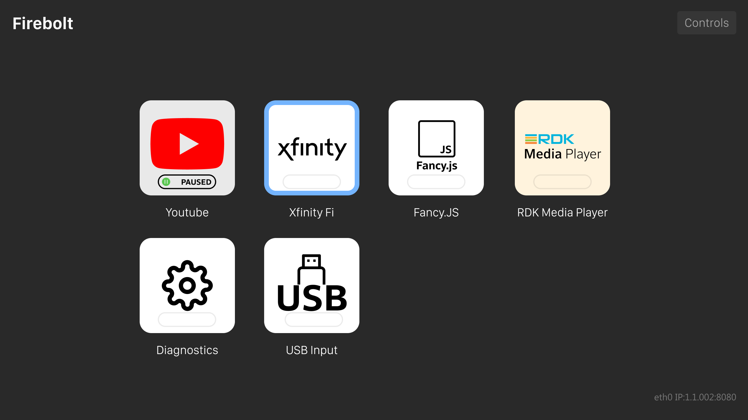
Version five was updated for internal teams. Version six was updated and deployed.
Version 5
Version 6


The combination of Paper prototyping and working with QA drove the development cycle of this product. It allowed the team to quickly produce an outcome that helped internal and external development teams reduce their applications' beta testing by weeks.
I want to give the QA team a huge thanks for all of their work supporting this application. Without their help, the design team would not have had the insights that drove many of the application's features.

Firebolt was my first experience leading not just other designers but everyone else in a team. Tracking those who reported to me was a big challenge. I created a doc that outlined each task, worker, discipline, check-in dates, and due date to solve that.
The other challenge was in getting to know everyone. Local workers are easier because grabbing lunch or just checking in will build a relationship. International workers are different because of the time difference in some cases that was 12 hours or more. After experimenting with ideas, hosting a snack break on Teams or Slack helped build better relationships.
Outcome